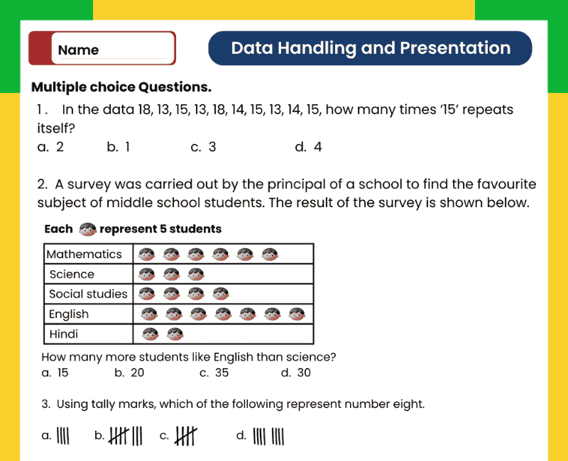
Data Handling and Presentation Class 6 Worksheet with Answers
Turn everyday information into meaningful tables and graphs with this Data Handling and Presentation Class 6 worksheet with answers. Use this resource alongside NCERT Class 6 Maths Chapter 4 – Data Handling and Presentation in the Ganita Prakash textbook to practise organising information, reading pictographs and interpreting bar graphs.
How can a class find its most popular sport? How can a library compare the books borrowed on different days? Data handling helps students answer questions using recorded information. The revision examples below connect mathematical ideas with familiar situations and provide additional practice alongside the worksheet.
Collecting and Organising Data
Data is information collected for a purpose. It may include the number of students choosing each activity, the kinds of vehicles passing a school or the number of books borrowed each day. Begin with a clear question, decide what to record and use consistent categories.
For example, a favourite-sport survey should specify whether each student chooses one sport or several. This matters when checking the total. If every student gives one response, the total number of responses should equal the number of students surveyed. Organising the responses in a table makes comparisons easier than reading a long unsorted list.
Tally Marks and Frequency Tables
Tally marks help record observations as they are counted. Each mark represents one observation. Draw four separate marks, then draw the fifth across them to complete a group of five. A count of 12 is recorded as two groups of five and two additional marks.
Frequency means the number of times a category or value occurs. After making tally marks, write the corresponding numerical frequency. Check each row, then add the frequencies to confirm that every response has been included.
| Sport | Number of students |
|---|---|
| Cricket | 12 |
| Football | 8 |
| Badminton | 6 |
| Kho-kho | 4 |
| Total | 30 |
Reading a Pictograph: Always Check the Key
A pictograph represents data using pictures or symbols. Its key tells you how many objects or people each symbol represents. Counting symbols without reading the key can give an incorrect answer.
Using the sports table above, cricket needs 6 circles, football needs 4, badminton needs 3 and kho-kho needs 2.
Number of students = Number of complete symbols × Value of each symbol.
For cricket: 6 × 2 = 12 students.
If a complete symbol represents 10 books, half a symbol represents 5 books. Use partial symbols only when their meaning is clear. Include a title, category labels and a key so another person can understand the pictograph independently.
Understanding Bar Graphs and Their Scale
A bar graph uses rectangular bars to compare quantities. For a vertical bar graph, categories usually appear on the horizontal axis and numerical values on the vertical axis. Bar heights represent the quantities. In a horizontal bar graph, bar lengths represent them.
The scale tells you what each equal interval represents. If one interval represents 2 students, a bar extending across six intervals represents 12 students. Read the labelled values carefully rather than assuming that every interval represents one.
For a clear Class 6 bar graph, use bars of equal width with equal gaps between them, label both axes and begin the numerical scale at zero. Choose equal numerical increments that fit the largest value and allow the data to be plotted accurately.
Answering Data Interpretation Questions
Read the title, labels and scale before answering. Identify what the question asks: a single value, the total, the difference between two categories or the category with the highest or lowest frequency.
Most popular sport: Cricket, chosen by 12 students.
Difference between cricket and football: 12 − 8 = 4 students.
Students choosing badminton or kho-kho: 6 + 4 = 10 students.
Write the category name when asked “which sport” and the numerical count when asked “how many students”. Include the unit or context in your answer.
Common Mistakes to Check
- Counting pictures without multiplying by the value in the pictograph key.
- Using unequal numerical intervals on a graph scale.
- Omitting the title, category labels or numerical scale.
- Adding quantities when the question asks for their difference.
- Recording one response twice or missing a response in the frequency table.
- Comparing the appearance of decorative pictures instead of the values they represent.
Before submitting your work, compare the original data with your table or graph. Every represented quantity should match its recorded value.
How to Practise NCERT Class 6 Maths Chapter 4
Attempt the worksheet independently before checking the answers. Keep a ruler, pencil and graph paper ready for drawing practice. For each graph question, note the scale first and show calculations for totals and differences.
Teachers can extend Chapter 4 practice with a small classroom survey. Students can collect responses, prepare a frequency table and present the same data as a pictograph or bar graph. Parents can use a reading log or a count of household items for similar practice. Discuss which presentation makes the comparison easiest to understand.
Use the answers to identify mistakes and improve your method. A neatly drawn graph is useful only when its labels, scale and quantities are accurate.
More NCERT Class 6 Ganita Prakash Worksheets
Practise the other chapters with these related Class 6 Maths worksheets.
→ Chapter 1: Patterns in MathematicsExplore number sequences and patterns in shapes. → Chapter 2: Lines and Angles
Practise geometric terms and angle measurement. → Chapter 3: Number Play
Explore supercells, digit sums and palindromic numbers. → Chapter 5: Prime Time
Work with factors, multiples and prime factorisation. → Chapter 6: Perimeter and Area
Calculate boundary lengths and areas of rectangles and squares. → Chapter 7: Fractions
Practise fractional parts, equivalent fractions and comparisons. → Chapter 8: Playing with Constructions
Develop geometric construction skills with a ruler and compass. → Chapter 9: Symmetry
Explore reflection and rotational symmetry. → Chapter 10: The Other Side of Zero
Understand positive and negative numbers on a number line.
Data Handling and Presentation Class 6 FAQs
1. Which chapter is Data Handling and Presentation in Class 6?
It is Chapter 4 of the NCERT Class 6 Maths Ganita Prakash textbook. The chapter explores collecting, organising, presenting and interpreting data.
2. What is data handling?
Data handling involves collecting information, arranging it clearly and interpreting it to answer questions. Tables, pictographs and bar graphs help make the information easier to understand.
3. How are tally marks grouped?
Tally marks are grouped in fives. The first four are separate marks and the fifth crosses them. For 13 observations, use two complete groups of five and three additional marks.
4. What does frequency mean in a data table?
Frequency is the number of times a value or category occurs. If eight students choose football, its frequency in that survey is eight.
5. What is the difference between a pictograph and a bar graph?
A pictograph uses pictures or symbols with a key. A bar graph uses rectangular bars whose heights or lengths represent quantities according to a numerical scale.
6. Why does a pictograph need a key?
The key explains the value of each symbol. If one symbol represents five students, four complete symbols represent 20 students.
7. What does half a symbol represent in a pictograph?
It represents half the value of a complete symbol, when the key supports that interpretation. If one complete symbol represents eight objects, half a symbol represents four.
8. How do I choose a scale for a bar graph?
Choose equal intervals that fit the largest value in the available space. For values 4, 6, 8 and 12, a scale of one interval representing two units is convenient.
9. What should a correctly drawn bar graph include?
Include a title, labelled axes, a clear numerical scale and accurately drawn bars. Use equal bar widths and equal gaps, with the numerical scale starting at zero for these basic comparisons.
10. How do I find the total from a graph?
Read the value of each category using the scale or key, then add the relevant values. Do not add only the number of symbols when each symbol represents more than one item.
11. How do I answer “how many more” questions?
Subtract the smaller quantity from the larger. If 18 students choose one activity and 11 choose another, the difference is 18 − 11 = 7 students.
12. How should I use the worksheet answers for revision?
Attempt the questions first, then compare your calculations and graph readings with the answers. For drawing questions, check the scale, labels and represented values as well as the final response.
 Download